9.12. Python Data Visualization Cheat Sheet#
import numpy as np
import matplotlib.pyplot as plt
import seaborn as sns
import polars as pl

# prepare data used for different plots
from datascipsych import datasets
raw = pl.read_csv(datasets.get_dataset_file("Osth2019"))
data = datasets.clean_osth(raw).filter(pl.col("phase") == "test")
perf = (
    data.group_by("subj", "probe_type")
    .agg(
        pl.col("response").mean(),
        pl.col("RT").mean(),
    )
    .sort("subj", "probe_type")
)
response_time = perf.pivot("probe_type", index="subj", values="RT")
conditions = (
    data.with_columns(
        response=pl.when(pl.col("response") == 0).then(pl.lit("new")).otherwise(pl.lit("old"))
    )
    .group_by("subj", "probe_type", "response")
    .agg(pl.col("RT").mean())
    .sort("subj", "probe_type", "response")
)
lures = (
    data.filter(pl.col("probe_type") == "lure")
    .group_by("subj", "lag")
    .agg(
        pl.col("response").mean(),
        pl.col("RT").mean()
    )
    .sort("subj", "lag")
)
Figure style#
Visual properties of figures can be quickly set by selecting a Seaborn style.
To set the style of figures made after that point, use set_style.
sns.set_style("ticks")
To temporarily set the style for one function, use the context manager axes_style in a with block. The example below (adapted from Seaborn’s tutorial) loops over the four Seaborn styles and temporarily applies them for one plot using axes_style.
f = plt.figure(figsize=(8, 2))
styles = ["darkgrid", "white", "ticks", "whitegrid"]
gs = f.add_gridspec(1, len(styles))
x = np.linspace(0, 14, 100)
for i, style in enumerate(styles):
    with sns.axes_style(style):
        ax = f.add_subplot(gs[i])
        n = 6
        for j in range(1, n + 1):
            plt.plot(x, np.sin(x + j * .5) * (n + 2 - j))
        ax.set_title(style)

Creating figures using Seaborn#
Seaborn is designed to take data from a DataFrame to make a range of different plot types.
Seaborn functions take a DataFrame and various keyword arguments that specify which columns should be used to determine different aspects of the plot. The most commonly used arguments are x, the variable to plot on the x-axis; y, the variable to plot on the y-axis; and hue, the variable that determines which data points should be displaed in different colors.
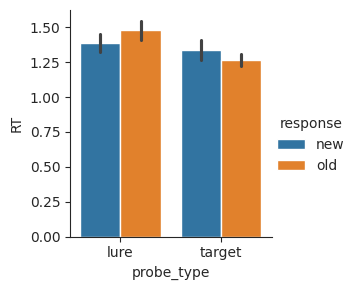
g = sns.catplot(
    data=conditions,  # data frame to take variables from
    x="probe_type",   # variable to plot on the x-axis
    y="RT",           # variable to plot on the y-axis
    hue="response",   # variable to split by to determine different colors
    kind="bar",       # kind of plot to use (varies by Seaborn function)
    height=3          # height of the figure in inches
)
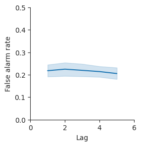
Seaborn figure-level functions, which include displot, catplot, and relplot, return a FacetGrid object. Use the set method of FacetGrid to set properties of the figure. Use set_axis_labels to change the labels of the x-axis and y-axis.
g = sns.relplot(data=lures, x="lag", y="response", kind="line", height=3)
g.set(xlim=(0, 6), ylim=(0, 0.5))
g.set_axis_labels("Lag", "False alarm rate");
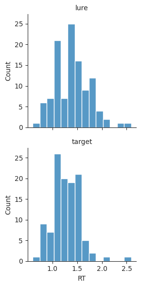
Figures may also be split into multiple columns using the col argument.
g = sns.displot(
    data=perf,         # take data from the perf DataFrame
    x="RT",            # plot RT on the x-axis
    col="probe_type",  # plot two columns with different probe types
    kind="hist",       # create a histogram
    height=3,          # set figure height to 3 inches
)

Using row instead will split plots by row.
g = sns.displot(
    data=perf,
    x="RT",
    row="probe_type",
    kind="hist",
    height=3,
)
g.set_titles(row_template="{row_name}");  # simplify plot titles
Saving figures#
Once a figure has been generated, it can be saved to a graphics file for use in presentations.
Use savefig to save a figure to a graphics file. The type of file is automatically determine by the file extension. Here, the file name ends in ".pdf", so we get a PDF file. Another common choice is ".png", which saves to a PNG file. PNG files are supported by a wider range of software, but have limited resolution, whereas PDF files can be scaled to any size.
# g.savefig("histograms.pdf") # uncomment and run to save figure
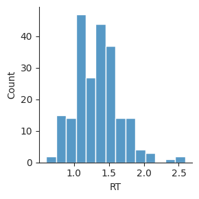
Histogram plots#
Use displot with kind="hist" to split a variable into bins and visualize how many values there are in each bin.
sns.displot(data=perf, x="RT", kind="hist", height=3);
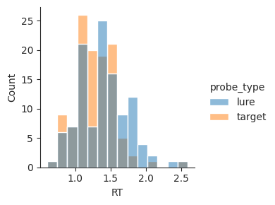
To visualize how a variable differs between two conditions (here, whether the trial was a lure or a target), set the hue argument to the name of the column with that condition.
sns.displot(data=perf, x="RT", hue="probe_type", kind="hist", height=3);
Kernel density estimation plots#
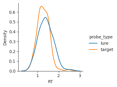
Use displot with kind="kde" to plot an estimate of how frequently each value of a variable is observed in a dataset.
sns.displot(data=perf, x="RT", hue="probe_type", kind="kde", height=3);
Bar plots#
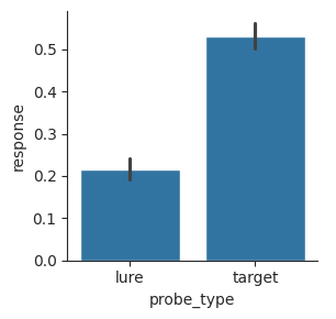
Use catplot with kind="bar" to show the central tendency of one or more conditions. Each bar shows the mean of the plotted variable. By default,the error bars show a 95% confidence interval of the mean, estimated using a bootstrap method.
sns.catplot(data=perf, x="probe_type", y="response", kind="bar", height=3);
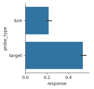
To change the orientation of the bars, switch the variables used for the x and y arguments.
sns.catplot(data=perf, x="response", y="probe_type", kind="bar", height=3);
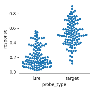
Swarm plots#
Use catplot with kind="swarm" to plot every individual data point in different conditions without overlapping any points.
sns.catplot(data=perf, x="probe_type", y="response", kind="swarm", height=3);
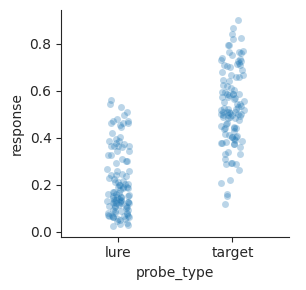
Strip plots#
Use catplot with kind="strip" to plot every individual data point in different conditions within a strip. Points are allowed to overlap. Setting alpha to a value less than 1 will make points translucent, making it easier to see all the points.
sns.catplot(
    data=perf,
    x="probe_type",
    y="response",
    kind="strip",
    alpha=0.3,
    height=3,
);
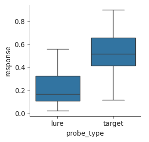
Box plots#
Use catplot with kind="box" to make a box plot, which shows the 25th, 50th, and 75th percentiles, the range of the data, and any outliers.
g = sns.catplot(data=perf, x="probe_type", y="response", kind="box", height=3)
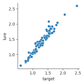
Scatterplots#
Use relplot with kind="scatter" to plot how two variables vary with one another in a set of observations.
sns.relplot(data=response_time, x="target", y="lure", height=3);
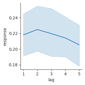
Line plots#
Use relplot with kind="line" to plot how a dependent variable varies over different values of an independent variable.
sns.relplot(data=lures, x="lag", y="response", kind="line", height=3);
Color palettes#
Seaborn accepts a palette argument in functions that plot data with a range of hues, to change how different values in the data are mapped to different colors.
Use a qualitative color palette when there is no inherent ordering of categories.
display(sns.color_palette())  # default palette
display(sns.color_palette("Set1"))
display(sns.color_palette("Set2"))
display(sns.color_palette("colorblind"))
Use a sequential color palette when there is a continuous range of values that you want to visualize.
display(sns.color_palette("viridis", as_cmap=True))
display(sns.color_palette("inferno", as_cmap=True))
display(sns.color_palette("magma", as_cmap=True))
display(sns.color_palette("rocket", as_cmap=True))
display(sns.color_palette("mako", as_cmap=True))


Use a diverging color palette when there is a meaningful center value (often zero) and you want to emphasize differences from that center value.
display(sns.color_palette("vlag", as_cmap=True))
display(sns.color_palette("icefire", as_cmap=True))

